Branding
Illustration
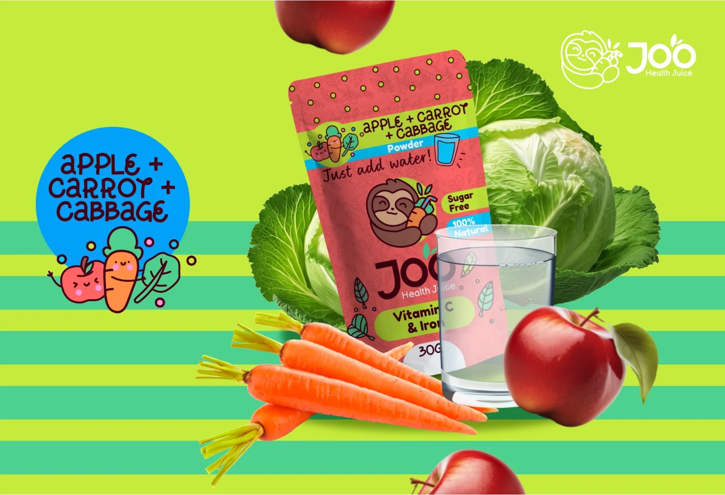
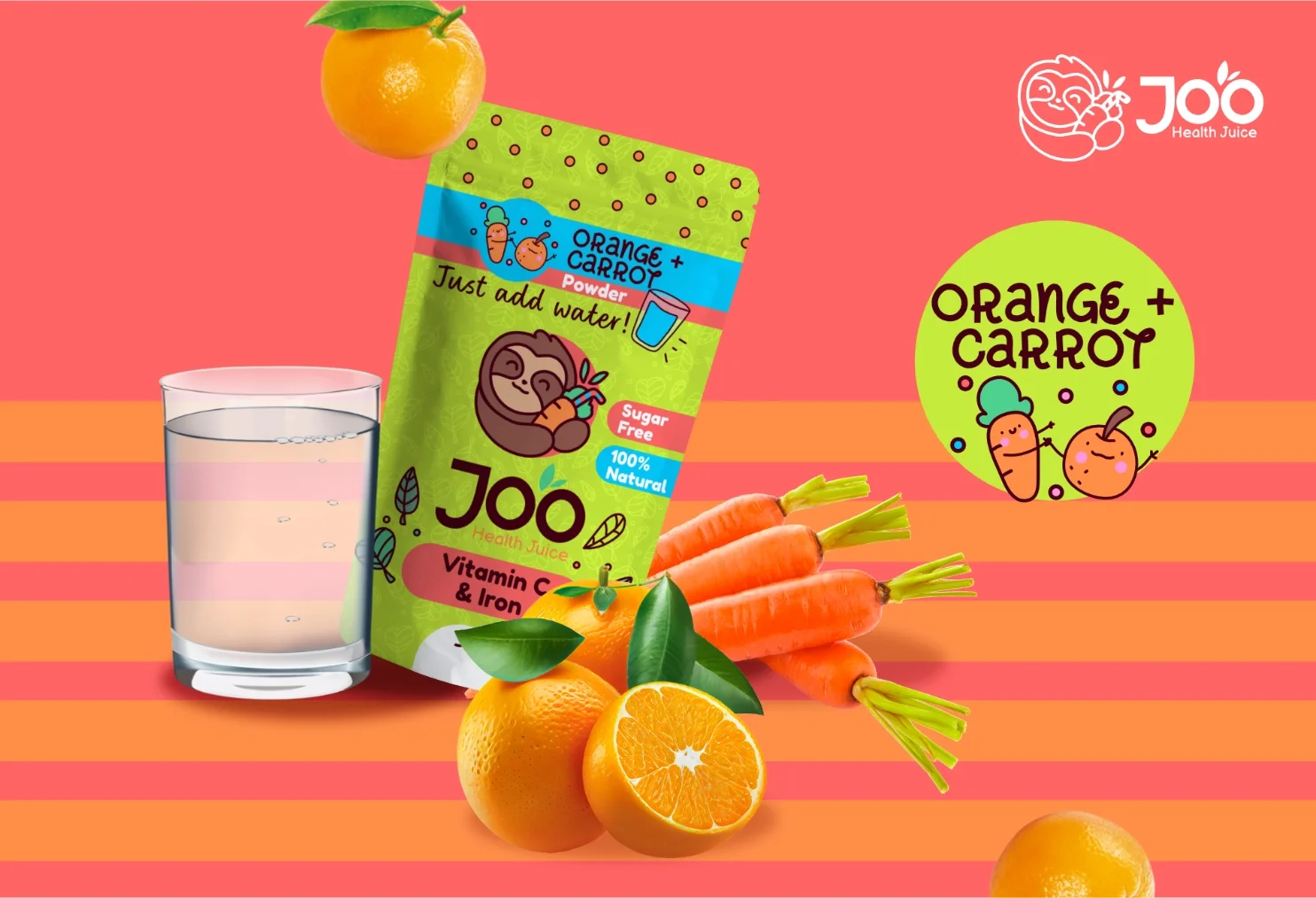
Packaging
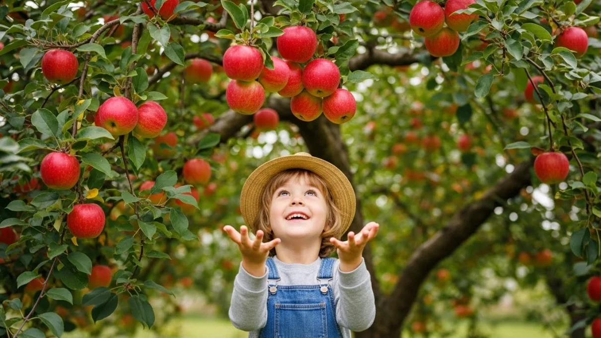
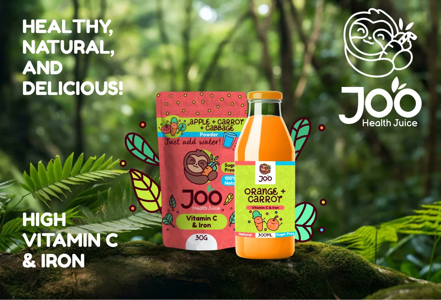
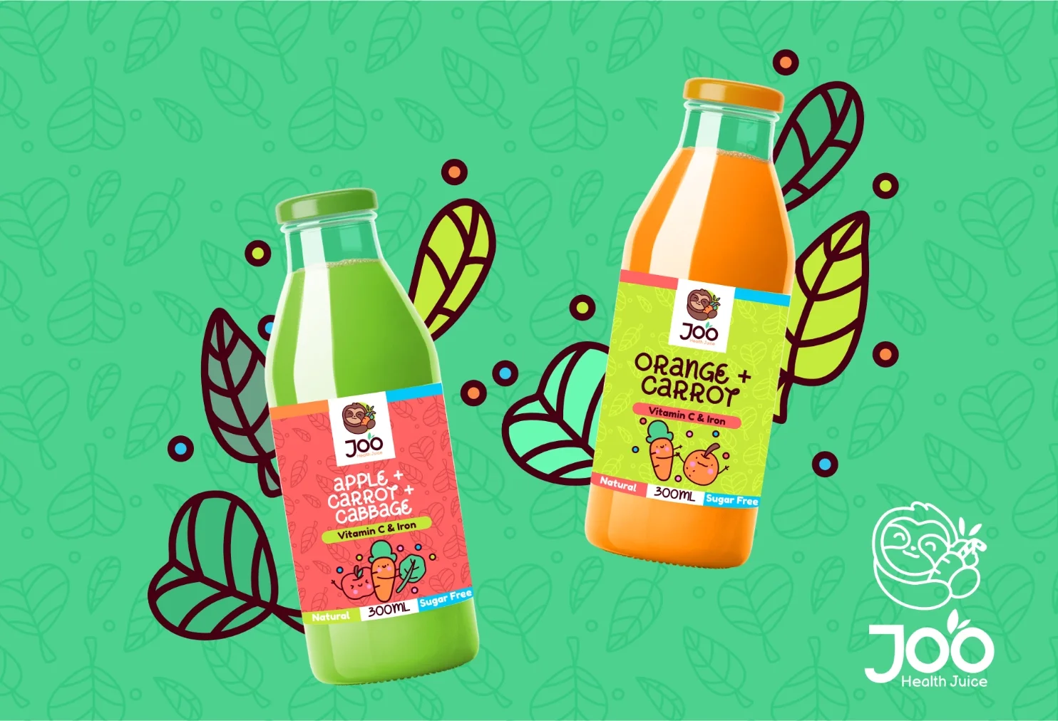
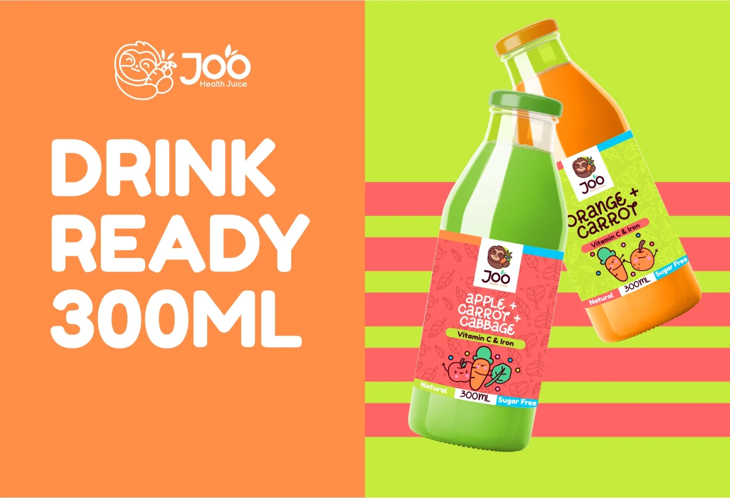
Nutritious, natural, vegan,delicious, and fun!
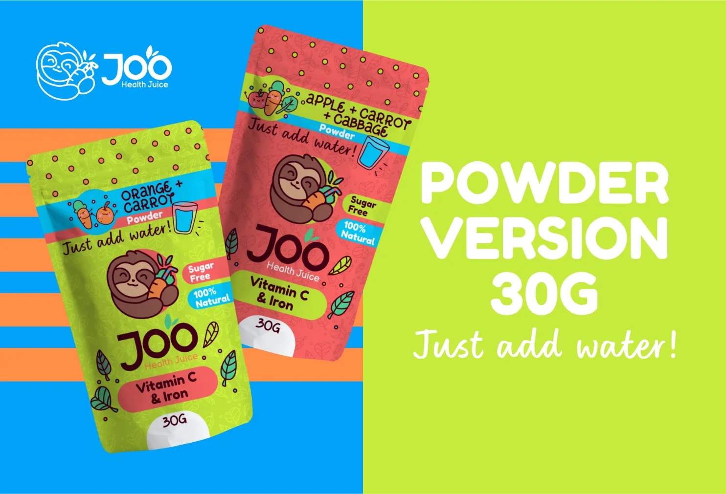
In two flavors, two ways of consumption. Ready on the go.
*Joo is a fictional illustrated brand.
Brand Approach
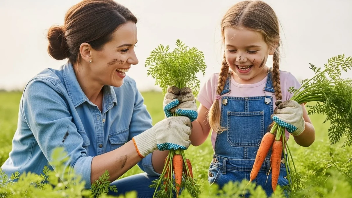
The brand is built around a gentle, caring approach to children, focusing on calmness, trust, and emotional comfort. Every visual and message is designed to bring a sense of care and reassurance to families with young kids, creating a peaceful and nurturing brand experience.

Color Palette
The color palette blends earthy tones for the sloth with bright, nature-inspired colors like vivid greens, orange, pinkish red, and ocean blue. This balance connects the brand to nature while keeping it playful and energetic, creating a fun, welcoming visual language that feels lively and engaging for kids.

Brand Icon
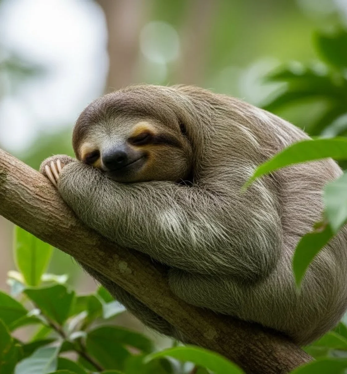
The icon features a happy sloth hugging a carrot, symbolizing calm care and gentle nourishment. Designed to represent Joo Juice’s mission of supporting kids with iron deficiency, the smiling sloth conveys warmth, trust, and a relaxed approach to healthy habits, while the carrot highlights the product’s natural, nutrient-rich focus.
Packaging Look & Feel
The packaging follows a fun, illustrated approach with animated ingredients, smiling faces, and vibrant pops of color. Designed to feel energetic and joyful, it helps kids associate iron and energy with fun and positivity rather than medication, turning the drink into a happy, playful moment they can relate to and enjoy.