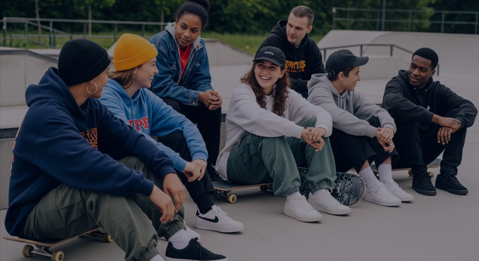
Persona — Fränk Energetic Drink
Age: 25–35
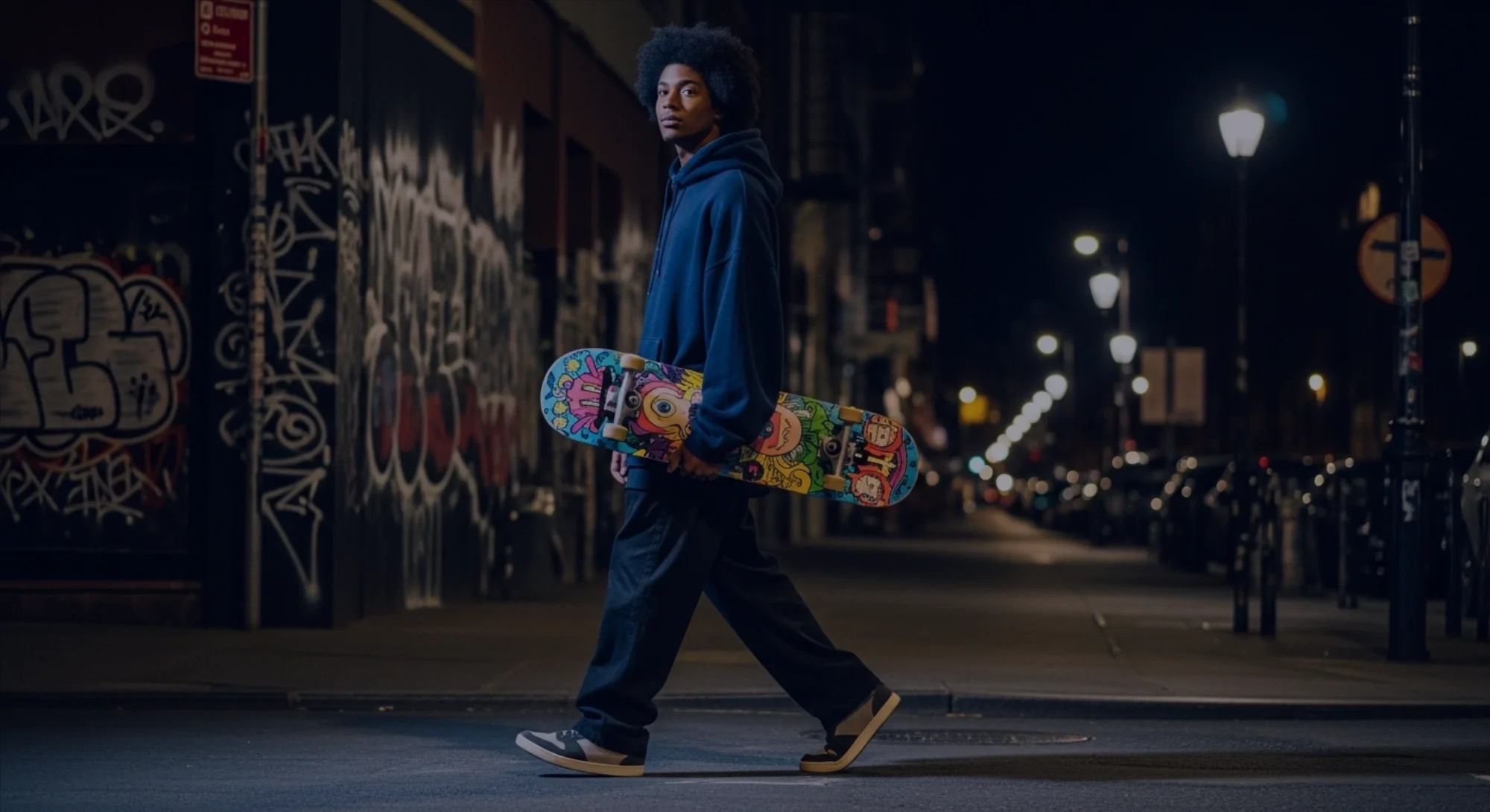
Profile: Active, creative, and street-culture driven.
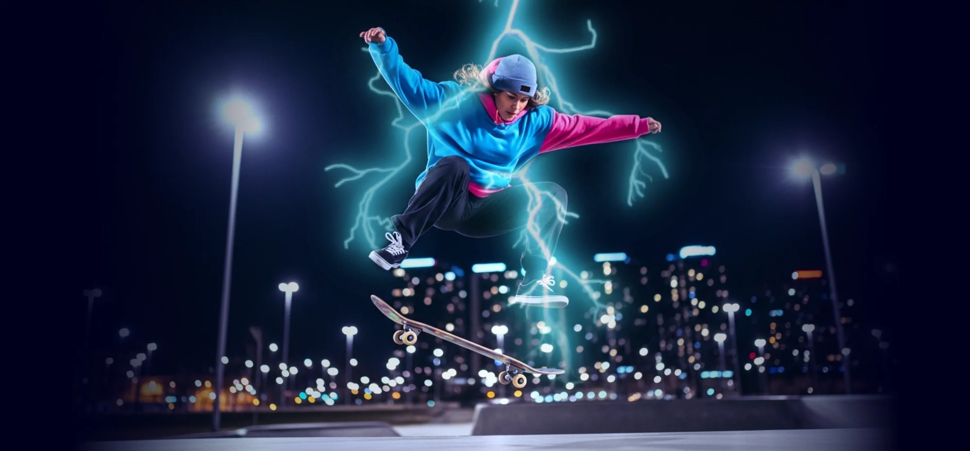
Frank’s consumer lives in motion such as skating, biking, training, or creating late into the night. They’re drawn to cartoons, graffiti, pop colors, and aggressive visual styles, and choose brands that feel raw, playful, and unapologetic. Energy isn’t just fuel; it’s part of their identity.
They choose Frank to stay moving when slowing down isn’t an option.
Creative Direction
Illustration
Visual System
Art Direction
Tools
ImageFX · Procreate · Affinity Designer
Creative Direction Exercise
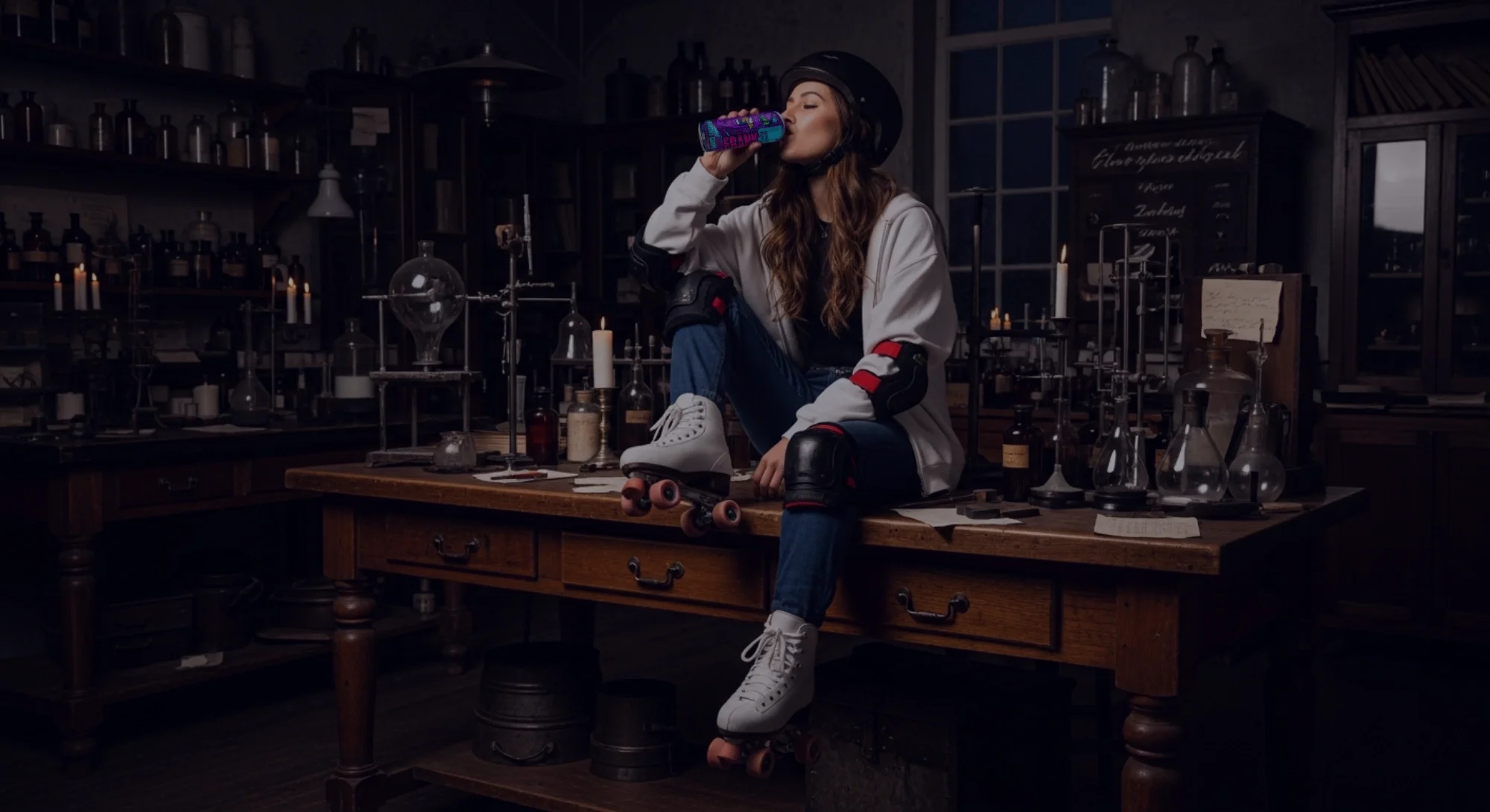
Frank Energetic Drink is a speculative energy drink brand imagining a world where raw electricity, street culture, and creative chaos collide. Inspired by classic gothic science and modern skate culture, the brand explores energy as activation rather than excess — a crafted force built for movement, expression, and momentum. A future that feels loud, physical, and unapologetically alive.
Brand Archetype: Rebel + Jester
Frank embodies the Rebel and Jester archetypes through movement, irreverence, and playful defiance. The brand challenges passivity and routine, valuing expression over conformity and energy over restraint.
Rather than polished perfection or corporate hype, Frank communicates through bold visuals, humor, and controlled chaos — inviting its audience to move faster, laugh louder, and break patterns without taking itself too seriously.

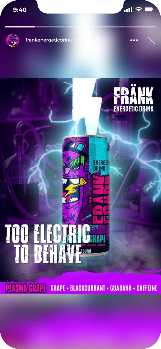
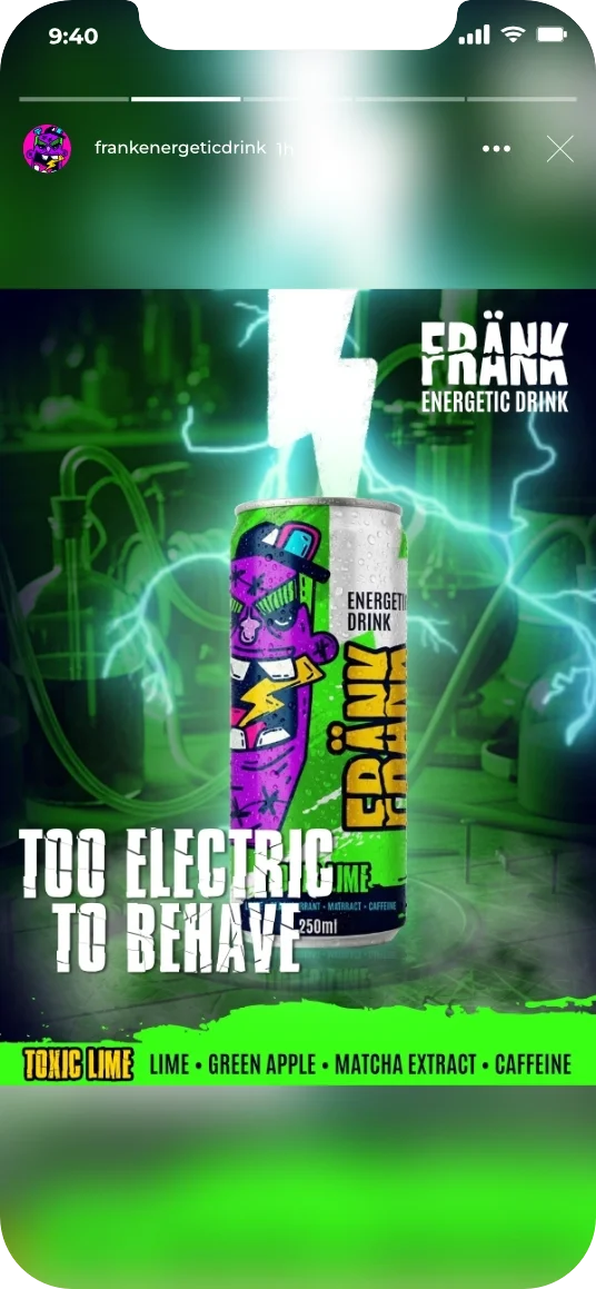
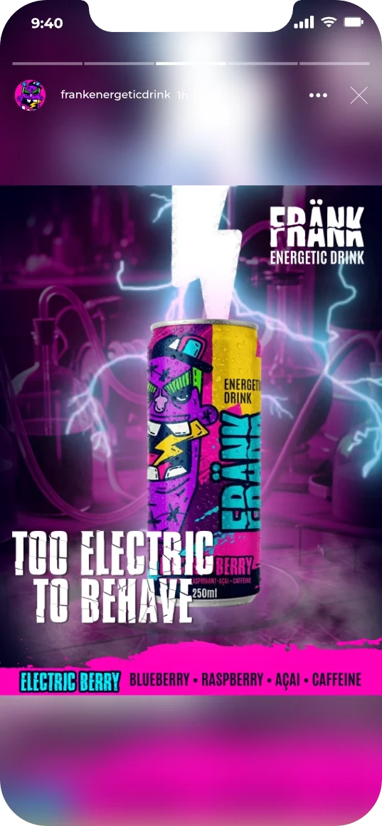
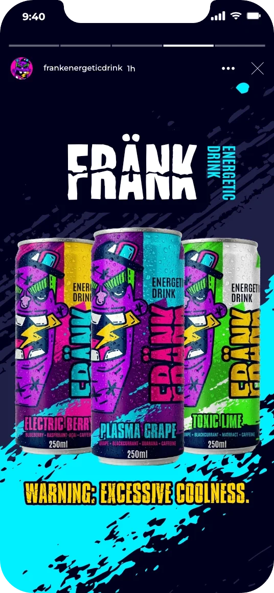
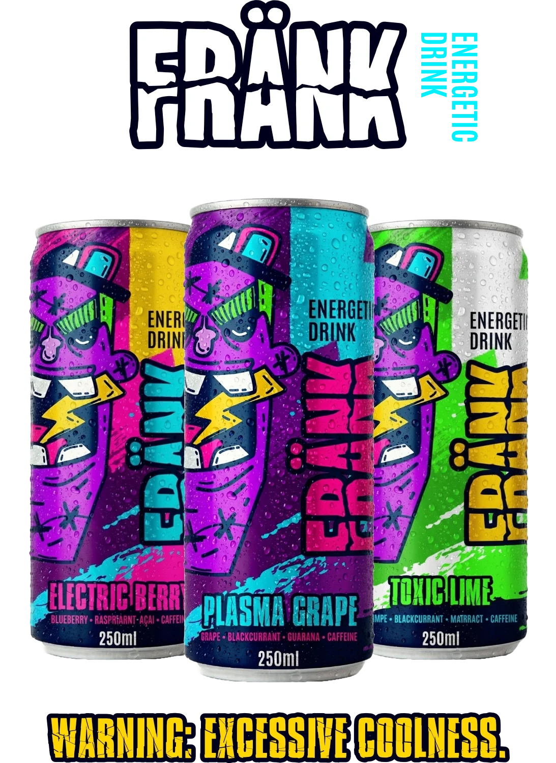
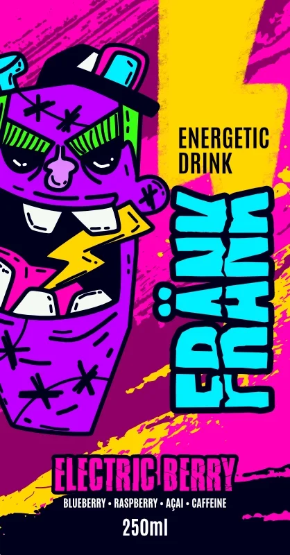
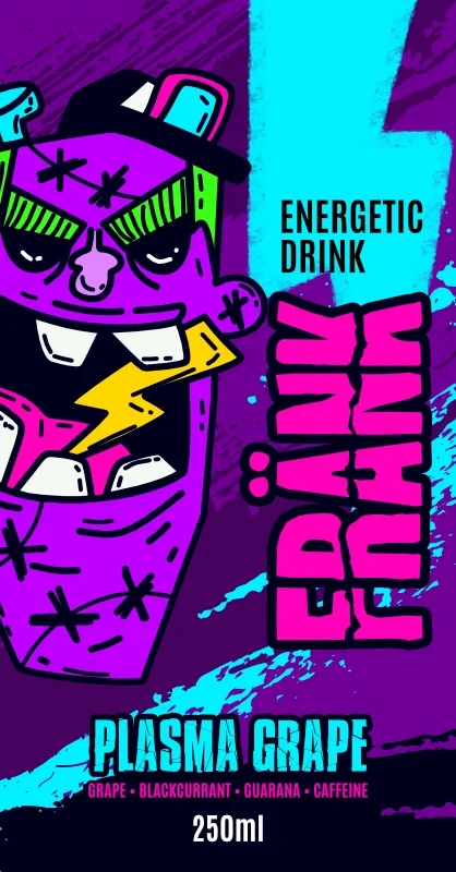
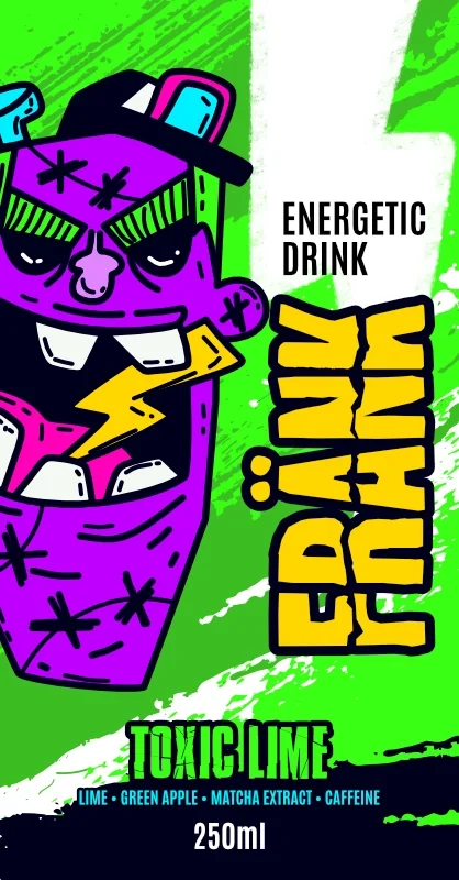
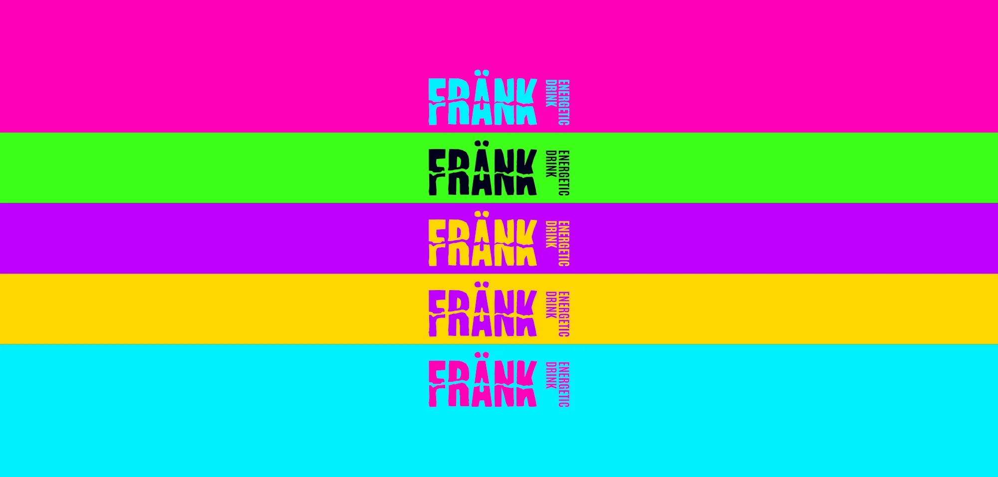
Color Palette
Electric purple, electric blue, neon pink, bold yellow, and neon green form a high-energy palette built to feel loud, playful, and disruptive. These colors reference electricity, speed, and street culture, echoing graffiti, cartoons, and radical sports visuals. Together, they express movement, irreverence, and creative chaos — translating raw energy into a bold, graphic language.
Dark blue and near-black anchor the system. Acting as a visual base, they create contrast and depth, allowing the neon colors to pop with maximum intensity. This dark foundation grounds the brand while amplifying impact, turning every bolt of color into a signal of energy and activation.
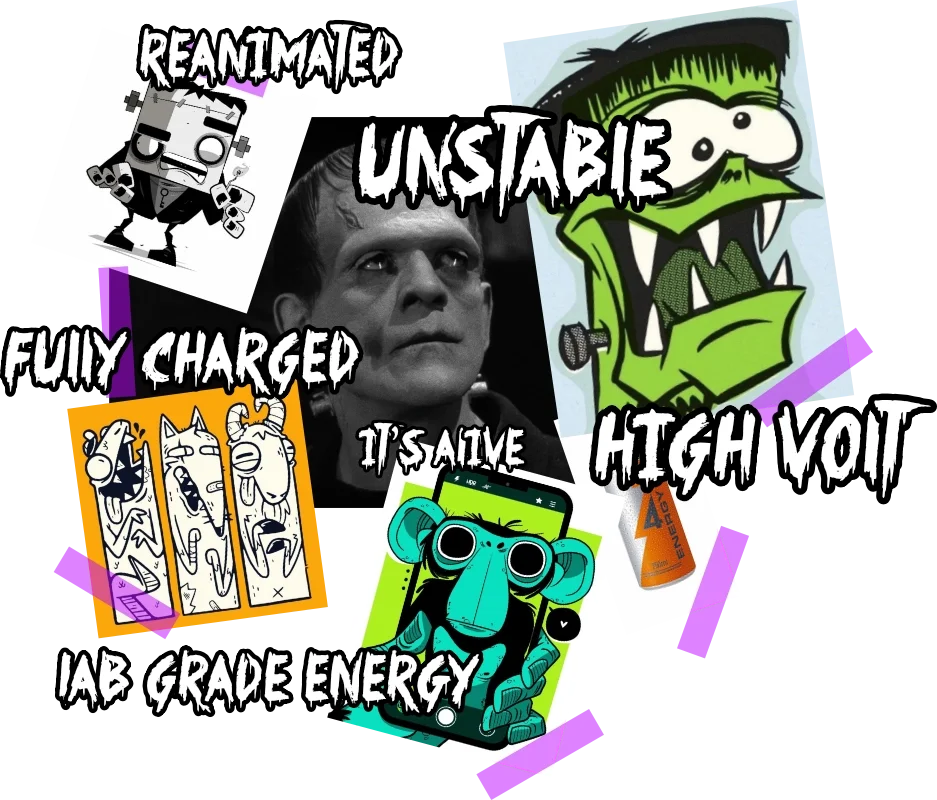
Moodboard
The visual references draw from Frankenstein by Mary Shelley, classic film interpretations, and bold illustration styles. The brand reinterprets the story’s core idea — creation through electricity — translating the lightning that brings Frankenstein to life into the energy contained inside the drink. Thunder, bolts, and electric tension become visual metaphors for activation, movement, and momentum, shaping a world where energy feels raw, graphic, and alive.
World Building
Frank Energetic Drink exists in a raw, urban world shaped by movement, street culture, and creative chaos. It reflects a reality where energy is visible, expressive, and part of everyday life — found in skate parks, graffiti-covered streets, and late-night city moments.
Through bold, graphic visuals inspired by street art, cartoons, and underground culture, Frank connects with young adults who express themselves through motion and attitude. The result is an immersive world that feels loud, artsy, and unapologetically alive — an energy drink that looks and feels as cool as the people who drink it.