
Branding
Illustration
Packaging
EcoKiwi creates sustainable, functional products that make a big impact through small daily changes — from what we make to how we make it, always reducing our footprint and giving back to the community.

Brand Icon
The kiwi was chosen as the brand’s protagonist to represent nature, protection, and balance. Its calm and friendly presence reflects EcoKiwi’s commitment to sustainable living, turning small everyday actions into meaningful environmental impact.
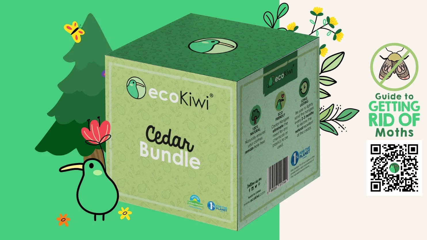
Packaging Design Style
The packaging was designed as a flexible pattern system to ensure consistency across all boxes. Using EcoKiwi’s natural color palette, the design stays clean, calm, and objective, while subtle hand-drawn illustrations add warmth, fun, and a cozy, nature-inspired feel.


Color Palette
The color palette is rooted in nature, using layered shades of green with forest green as the main tone, supported by lighter greens and a deep ocean blue. These colors reinforce EcoKiwi’s natural values while blending seamlessly with the kiwi icon, creating an authentic, calm, and trustworthy visual identity.


Moth Repeller Design
The moth repeller was designed with a soft, illustrated approach to turn a functional product into a friendly, approachable solution. Using simple illustrations, the design communicates protection and care in a calm, non-toxic way, aligning with EcoKiwi’s sustainable values while fitting naturally into everyday home spaces.

Brand & Packaging Overview
The EcoKiwi brand and packaging use sustainability as a design context, expressed through calm visuals and consistent systems.
A natural color palette, repeatable patterns, and the kiwi icon create a clear, approachable identity that fits naturally into everyday life.